
When designing a space, we take several principles into consideration: proportion, scale, and balance, just to name a few. And then there’s contrast. Whether it’s represented by color, texture, or shape, we believe it has the ability to take a room from almost-complete to complete perfection.
Why incorporate contrast?
Simply stated, contrast adds visual interest. Without it, a space can look flat because there is nothing to catch your attention. With that said, contrast must be used intentionally and harmoniously with the aforementioned principles or it will lose its impact. Or worse yet, it won’t be noticed at all. A skilled designer will find a delicate balance between incorporating too much contrast and using too much restraint.
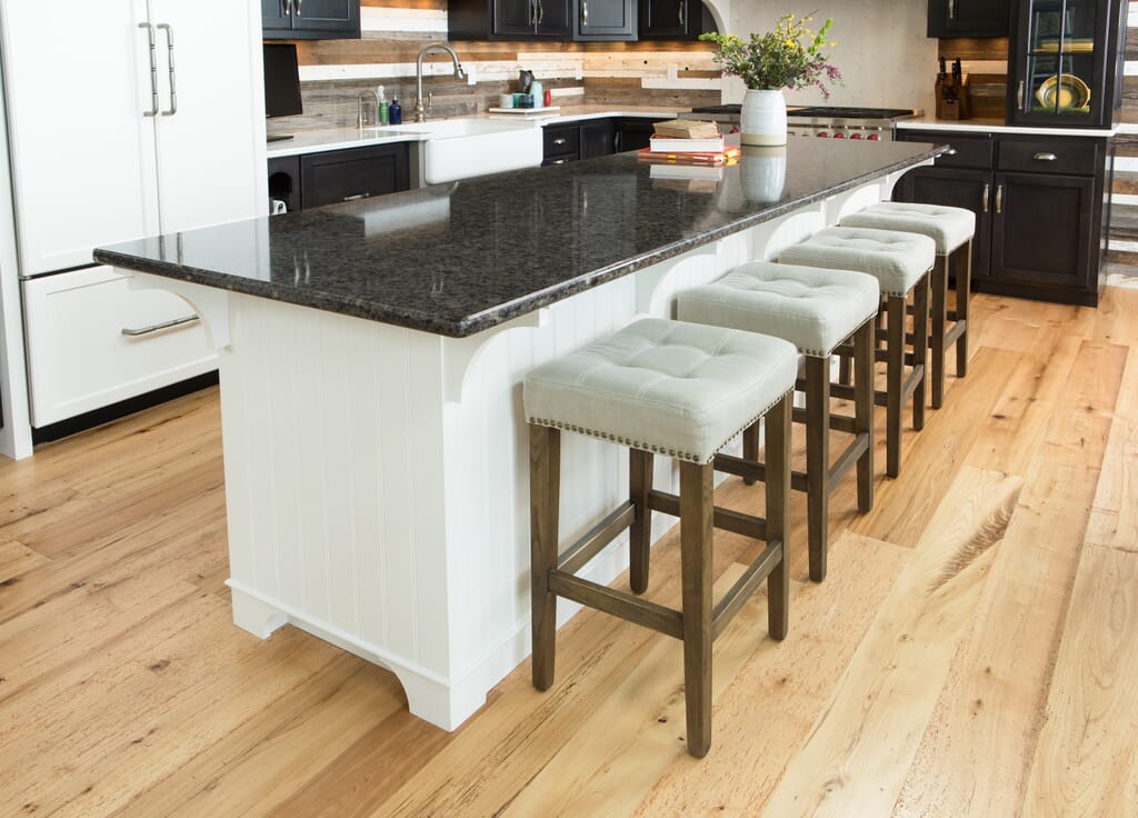
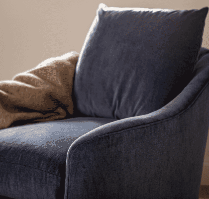
Furniture and accessories shown: Katie Counter Stool, Beehive Crock
How to incorporate contrast
When we say contrast, the first image that comes to mind probably looks something like the example above. Black and white – or at the very least, dark and light – is a well-known example of contrast. However, unifying a space and creating a well-designed interior composition is more than simply pairing black with white. This is where design principles and elements like proportion, balance, and texture come into play.
In the above image, the homeowners beautifully represented contrast not only on a large scale with the black and white color scheme, but also within the details. First, to unify the contrasting colors there is the use of mid-tones, like the brushed nickel cabinet hardware and speckled gray and natural tones in the primarily black granite countertop. The rustic gray-toned wood backsplash also acts as a unifying color along the back to unite the black cabinets and white sink and countertops.
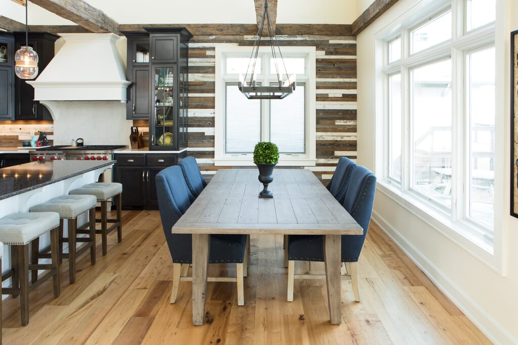
Furniture and accessories shown: Katie Counter Stool, Jessica Side Chair, Grayson Extension Table, Medium Black Vase, Boxwood Ball
And then there is texture. With several smooth and shiny surfaces, the texture of our Katie Counter Stools, Jessica Side Chairs, and the home’s reclaimed wood accents infuse contrast to prevent the space from feeling too one-dimensional. This textural contrast can also carry through to the living room area, especially when the layout is as open-concept as this gorgeous modern farmhouse on the Bay.
In the home’s living area, the hard stone surface of the floor-to-ceiling fireplace is flanked with our upholstered Virginia Wing Chairs and heavily textured White Mohair Pillows to soften the look. And of course the color contrast is carried through from the kitchen and dining area with not only the chairs and pillows, but in the tabletop accessories, lanterns, and candles.
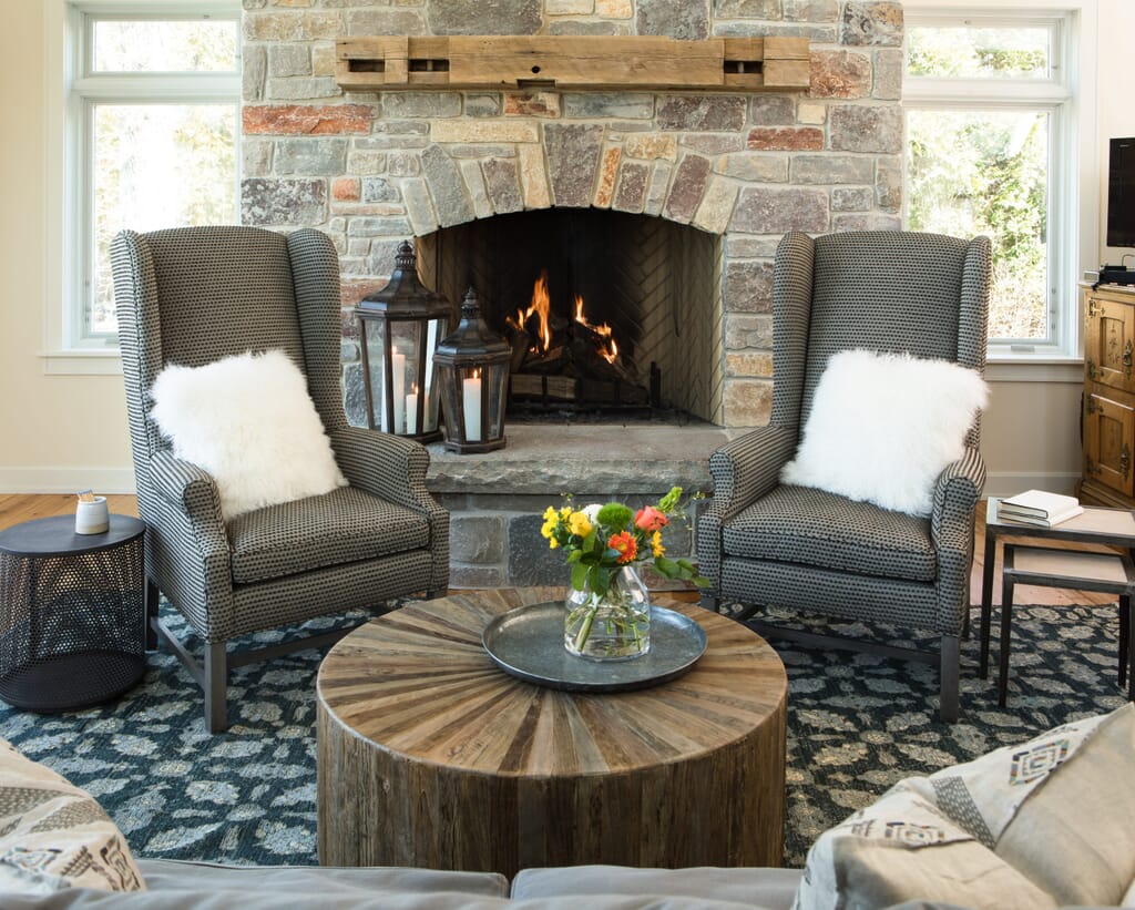
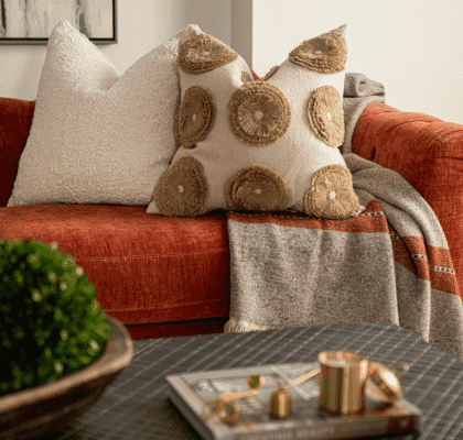
Furniture and accessories shown: Gunther Table, Virginia Wing Chair, Morgan Lanterns, White Pillar Candles, Cecilia Coffee Table, Alvarado Tray, Amadi Blue Print Rug, Herringbone Diamond Pillows, Lily Nesting Tables, Medium Books
Regardless of your style preferences, there is always an opportunity to incorporate contrast as these homeowners did with their savvy design style. Combined with our designer’s incorporation of August Haven furnishings, the beauty of this home was enhanced to create a timeless space that still feels fresh. Visit our design services page or talk to one of our interior designers to learn more about getting started on your design transformation.