
Deep breath in, deep breath out. Close your eyes, now imagine stunning warm tones of maroon, salmon, fuchsia and marigold. No, you’re not crazy – just by thinking of this family of hues, your body temperature immediately rises, heart rate increases, and mood is overall happier. Reminding us of heat, sunshine and intense emotions of passion and joy, warm colors can be stimulating in the best possible way.
Even Pantone recognizes the glowing optimism and illuminating strength and possibility that can be found in warming colors with its 2021 Color of the Year, ‘Illuminating.’ Bringing these tones into your home in the form of furniture, accessories, or even paint color can provide an extra dose of positive energy, which is something we could all use a bit more of! Read along to learn more about how we integrate warm tones into interior design. Or, watch our designer and buyer, Amanda, create the look right before your eyes here.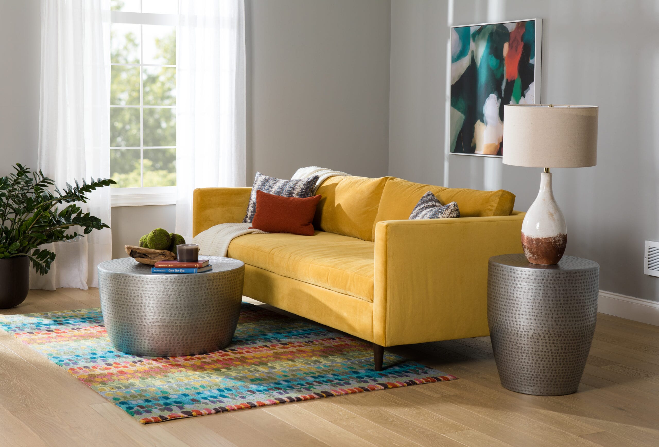
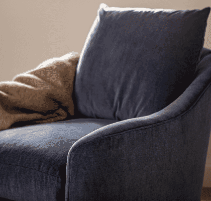
The morning sun shines in and casts a warming glimmer of light on a refreshing space. The mood is set, and it’s one of happiness, optimism, and passion. As you can likely tell, we recently designed this room with a variety of warm tones in mind. We begin with one of our favorite statement pieces, our Jonathan Estate Sofa. Casual elegance meets mid-century modern styling with this dazzling piece. When integrating a bold color into your home, you may be tempted to accentuate the remainder of your room with a variety of neutrals; we encourage you to take a leap of faith and continue the color statement throughout the room. This can provide a stimulating energy, which is perfect for social rooms like the living room, dining room, or kitchen.
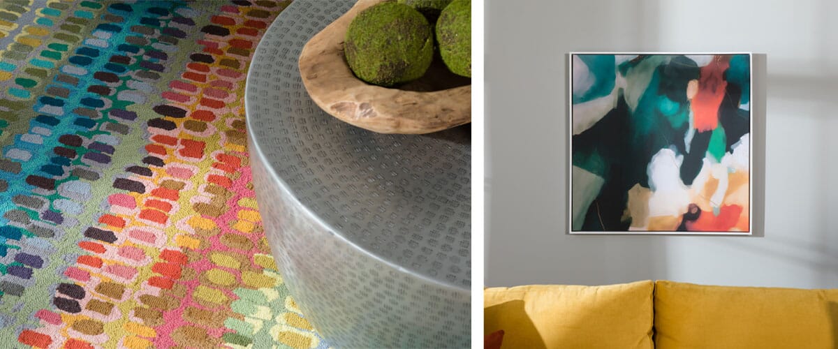
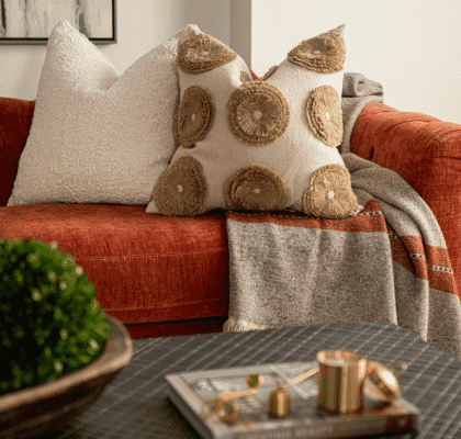
To highlight our favorite accent colors that are featured in Jonathan’s fabric and pillows, we chose a wildly colorful rug and piece of bold wall art. Our Kinsley Art is both modern and abstract, beautifully complementing the mid-century modern style of the sofa. Warm hues are paired with their cooling counterparts in the expressive brushstrokes of this piece. We matched this liveliness with the brilliant patterns found in our Paint Chip Hooked Rug. The addition of these vibrant accent pieces gives an undeniable energy to the set.

Designing with bold colors is a balancing act, walking a fine line between a positive warming energy and overstimulation. To provide a bit of relief to the room, we chose to accentuate with a few natural elements. The intricate knots and natural design of a teakwood bowl filled with unique moss spheres brings an intriguing elegance to the room. Additionally, the warm terracotta base of our Preston Table Lamp adds an earthiness while showcasing a warm rust color. We completed the look with a knit cream throw whose chunky weave lends a beautiful, textural finish to the space.
Although it may be intimidating to take the initial leap, remember not to shy away from warm colors when designing rooms in your home. Start the process by adding small pops of color or finding a few paint chips that you think will work beautifully together. We promise these small steps will be worth it in the end. The final look can bring a warmth to your space that you never imagined you could achieve.